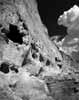
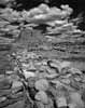
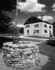
|
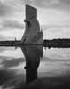
Although most of my work is in color, there are some subjects that naturally lend themselves
to the abstraction of monochrome reproduction. All of my originals are shot on color film - mostly 100 ISO Fujichrome
slide film. These color originals are ideal starting points for creating monochrome images. The color original
has red, green and blue "channels." A monochrome image can be formed by adding these channels together
in differing proportions to create a single new grayscale channel.
A "normal" conversion would use approximately 30% Red + 59% Green + 11% Blue to produce an image with
luminance similar to the color original. But I can use different mixtures to create specific effects. This simulates
the use of colored contrast filters when exposing black-and-white film, except that I have an infinite number of
possibilities and I can do it afterwards, previewing the effect on the computer screen.
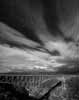
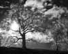
For example, to get dark dramatic skies I would traditionally place a red filter over the camera lens. On the computer,
I do it by mixing a higher proportion of the red channel and a lower proportion of blue. So I might use 50% or
60% Red, and very little Blue. Sometimes I even subtract blue, for a really dark sky.
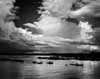
Once I have a monochrome image, I can apply local and global contrast and brightness controls. Photoshop's Curves
control allows me to create a uniquely-tailored transfer curve for each image (or even for individual areas within
an image.) Since this curve is analogous to the "H&D" curve of photo emulsions, it is as if I were
creating a unique emulsion for each picture. This is Ansel Adam's Zone System carried to its logical extreme. Ansel
would have loved Photoshop!

|